To prevent abuse of free credits, we use a hashed device signal (browser identifier, basic device characteristics and network). We don't store the raw values.
Markers and whiteboard
Line art
Colour illustration
Business and diagrams
Dark boards
Same script, different pen. The style changes how the video feels more than any other setting.
Updated: 2026-10-26
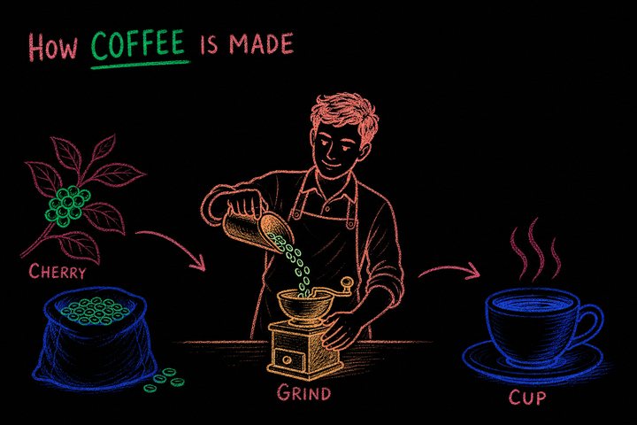
Black outlines with a few flat colours are the default whiteboard look and the safest choice for explainers. Marker adds vibrant fills and expressive faces, which suits stories and children's topics. Sharpie is the same idea with thicker lines and fewer colours; it reads best on phones.
Chalkboard and crayon draw as finished strokes with visible texture, so they are rendered colour first rather than outline then fill. Chalk says classroom; crayon says warmth and childhood; etching says history and gravitas. Textured styles hide small drawing errors well.
When the goal is to be understood rather than to be charming, pick a diagram style. Labels, arrows and boxes appear in narration order, with no characters or scenery. Technical is a blueprint look; formal is a two-colour ink diagram for corporate use.
Creative uses loose ink with a splash of colour on a few elements and invents visual metaphors; it is the style behind most of our gallery. Editorial gives elongated magazine figures in a warm three-colour palette. Illustration renders full storybook scenes, best for narrative.
Classic or infographic for clarity; chalkboard if you want the classroom feel.
Creative or marker. They have the most personality and hold attention in the feed.
No. One style per video keeps the drawing consistent; try the same script in two styles and compare.
Whether the pen draws outlines first and colours later, or lays finished colour in one pass. Textured styles default to one pass.


